Bridg
Cardlytics acquired Bridg to run the top banking rewards programs so their customers enjoy an enhanced, personalized experience that drives loyalty. During my time there I set out to create a simple and coherent visual narrative to create a path to the understanding of the ad platform. The new brand belongs in the digital space and adapts easily to different business areas, verticals, mediums, etc.
DESIGN STRATEGY / ART DIRECTION / COPY

A symbol for growth, enlightenment and progress.
The new logo allows for easy recognition featuring the uniqueness of the name, and it’s extraordinarily simple: two linked arches that effortlessly express the ideas of illumination, impact and connection. It also works across various platforms and scales, from the small-space digital world to environmental installations.

Connecting experiences
The Bridg symbol also implies the link or connection of seemingly unrelated moments, products or experiences where the only constant is the new brand.
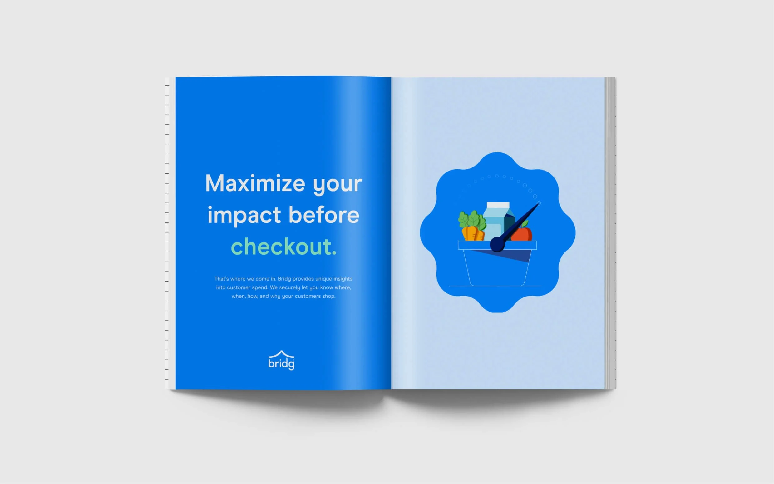
Illustrations
I developed a set of conceptual illustrations, a key communication tool in the new brand to help the understanding of the business—they introduce narrative elements to visual content that are part metaphorical, whimsical, and outcome-centric.


Bridging brand and business
Below you can get a taste of a few initial activations that show how the new brand will look like in market.